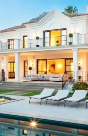
Spring is here, and it's time to decorate your home with the latest trends. Natural fabrics, organic shapes and handmade offerings are the stars of the interior design trends this season, but what colours are in? The possibilities are endless: earth tones, greens, blues, bright colours such as orange, and even much softer hues.
With such a vast choice, the key is, more than ever, knowing how to combine them successfully. And why not take a risk? With so many alternatives, contrasts are a more than attractive option in the living room, bedroom or even the bathroom or kitchen. Let's take a look with help from Habitissimo's experts.
Earth tones that create a sense of serenity
Browns, beiges and ochres have been on trend for a long time and remain centre-stage in interior design this spring. These tones create welcoming, calm environments. Moreover, they combine perfectly with a wide range of colours.
Pairing two earth shades of earth tones works very well. But you can also put them with more intense colours to help create contrasts and give a cheerful touch. In this sense, mustard, oranges or reds are perfect and can be included in decorative elements, such as accessories or textiles.

Deep blue for a touch of elegance
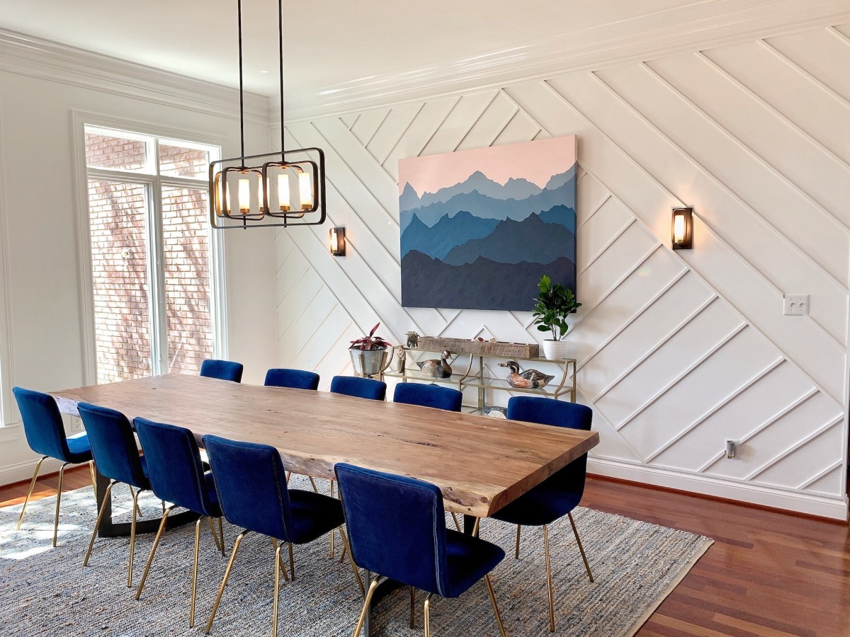
Blue reminds us of the sea and the sky. Since all things natural are in fashion, blue cannot be missing from any interior design. But its palette is immense. Which shade will be the most popular this spring? We're betting on technological or electric blues.
These tones are more intense than the lighter, more subdued shades that were popular just a few months ago. They also add a touch of sophistication and elegance. And, as if that weren't enough, they go well with greys, whites and lighter earth tones. However, they should be used in moderation so you don't overload the room.
Intense green brings joy and vitality
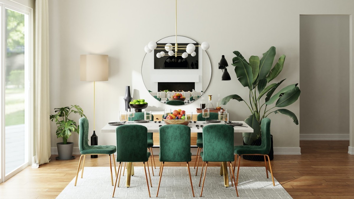
Green seems to follow a similar pattern to blue. From the other lighter or olive colours, we are now moving on to others that are much more vivid, such as emerald green. This cheerful, eye-catching colour can be used for small details in living rooms and bedrooms. Green is also becoming more popular in bathrooms, on furniture, accessories or even wall coverings.
Although it may seem complicated to combine, the truth is that it is not at all. Emerald green looks great with neutral tones, such as white, grey or camel. But also goes well with other, much brighter shades, such as mustard and orange.
Pastel colours: always elegant and balanced
When spring arrives, these colours always make their way into interior design trends in one way or another. This may be because they are fresh and bright or because they go so well with almost any other colour, especially neutrals. In small doses, they bring serenity and elegance without being overpowering. But this spring, if one colour stands out, it is pink, perfect for rooms where serenity must reign, such as the bedroom.
These colours are the main players in this spring's deco trends. But others also have their place: reds, purples, yellows and oranges, perfect for giving your home a cheerful vibe.