
In the film Air, which tells the story of the agreement between the sportsman Michael Jordan and the firm Nike, one of the scenes in which Ben Affleck, playing the firm's director, confesses that he paid very little for the company's logo. A logo recognised the world over because it is what any compelling design should be: clean and simple. We know that in both design and decoration, less is more.
Nike's logo was created in the 1970s when the company launched a competition in which 35 graphic designers participated. The successful candidate was a woman, Carolyn Davidson, who worked on several ideas, one of which won: the Swoosh, resembling a wing alluding to Nike, the Greek goddess of victory.
She was paid $35 for the design, and the Nike manager who commissioned it even remarked that he didn't love it but was in a hurry to launch it... Davidson continued to work for them until Nike hired its first external advertising agency in 1976.
A few years later, Davidson was called to the company's offices to receive a series of gifts, including a diamond ring engraved with the Swoosh and an envelope containing 500 shares in the company, at least some financial recognition to compensate for the meagre $35 she was initially paid. Nike would then remove the brand name from the logo.
This is not the only example of a logo worth a fortune today but which cost very little in its day. If we go to the field of music, who doesn't associate the famous red pout with the Rolling Stones? The Rolling Stones' red lips, also known as the Hot Lips logo, were also created in the same decade, in the 1970s, just around the same time the group was setting up the label. The author was the designer John Pasche who drew the logo while studying at the Royal College of Art in London. The first time it was seen was on the cover of the Sticky Fingers album, which had been designed by Andy Warhol (hence many people think he designed the logo too) which depicted a man's crotch in tight jeans, bulge and all, with the zip opening (Spain was not in the mood for such fun at the time and censored it). Jagger naturally inspired the mouth, and the tongue refers to the Hindu goddess Kali, the goddess of eternal energy.
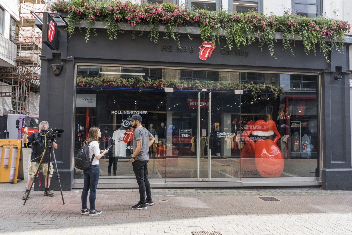
After two weeks working on the design, the designer pocketed £50 for the logo which has been reproduced millions of times on all sorts of merchandise. In 2008, the Victoria and Albert Museum bought the original design, which is still exhibited there, for more than $92,000.
Not only designs were bought at bargain prices, but there are also cases of patents awarded for ridiculous amounts compared to the economic benefit they have obtained over time. One example is a board game that almost everyone has played at some time: Monopoly.
It is often attributed to an American engineer, but the original author was Elizabeth Magie Phillips, an inventor and women's rights activist. She created the game in 1902 and called it The Landlord's Game.
Magie keenly followed the ideas of the economist Henry George who argued that the wealth obtained from nature should be distributed equally among everyone and established a single tax system to tax the income from the land. Magie launched her game in 1904 to raise awareness of these ideas: the game had two sets of rules, and players could switch from one system to the other. She patented her invention in 1905, and the Parker Brothers Company bought the patent from her for $500 in 1936. A few months earlier, Charles Darrow, already familiar with Magie's game, patented a modified version that included the word Monopoly. He sold millions of copies, and the same company, Parker Brothers, bought the patent from him, but unlike Magie's contract, his included royalties, making Darrow a millionaire.
Let's finish our tour of well-known logos with a company that did pay a lot of money for its logo when it commissioned Salvador Dalí: Chupa Chups. The firm already had a design but wasn't convinced, so they commissioned the Catalan artist to give it a new look. No one knows how much he was paid, but rumour has it that the artist took only an hour to make the design and he charged an astronomical amount for it. He only made a few tweaks but they did the job. He used one colour - red - on a yellow background and also introduced the flower shape around the name. Lastly, he positioned the logo on the top of the packaging, so it would be more visible.